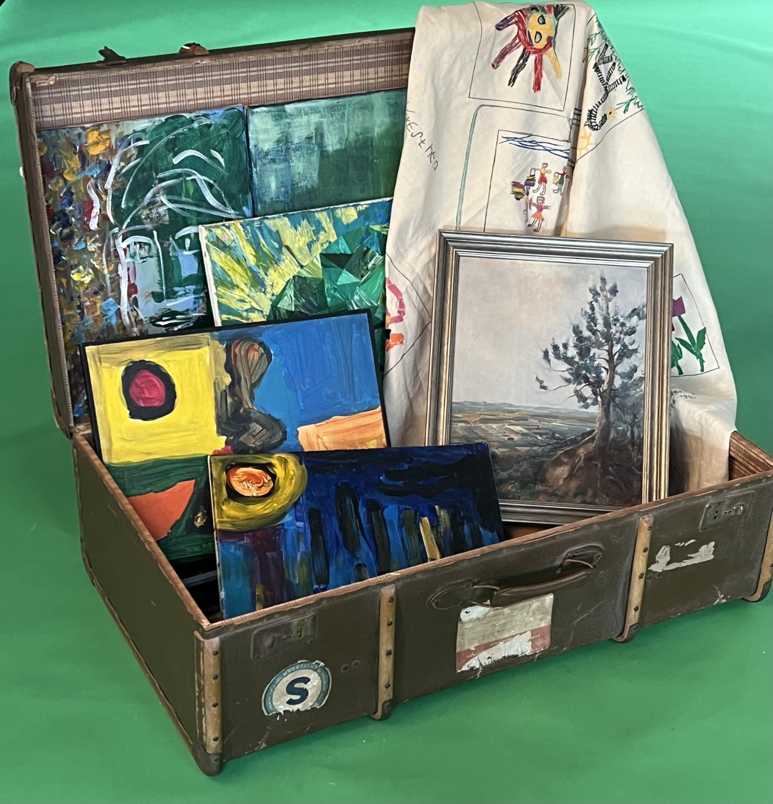
Arts of the Earth is grounded in people’s experiences and rooted in creativity and artistic expression. Our logo embraces the earth and the three primary colours as core principles. The earth is a circle and a shape that communicates connectivity. The three primary colours—red, blue, and yellow—symbolize a rich creative tapestry of possible art experiences, each imbued with lines and shapes as roads to empowering diverse learners, marginalised communities and creative educators and families through art, creativity and play.


Esther Joosa is the founder of Arts of the Earth Learning Hub. Originally from the Netherlands, she made Singapore her home 36 years ago. She holds a PhD from Nanyang Technological University in visual arts and a Master’s and Bachelor’s in early childhood education from QUT Australia. Over the past years, she has worked tirelessly in practice and research to advance insights into the role of visual arts and creativity in young children, individuals with diverse abilities, and marginalised communities. Her experiences are well cited and translated into her vision and mission of Arts of the Earth: To contribute to a world that celebrates human diversity and in which the arts foster communication, encourage creativity and cultivate profound connections across cultures in the community within the family.
Our experiences across the globe contribute to the vision of arts of the earth that, through the visual arts, individuals and communities become part of a transformative multimodal journey that intertwines and includes reflecting and acting on social narratives. Our mission is to create inclusive spaces where individuals embark on a shared odyssey through the realms of creativity, weaving stories through visual arts. When we learn to read each other’s artworks, we bridge diverse backgrounds, ignite empathy, and celebrate the richness of human experience. Our mission is to harness the power of art as a catalyst for dialogue, understanding, and connection, nurturing a world where every brush stroke becomes a testament to the dialogue of a shared journey.


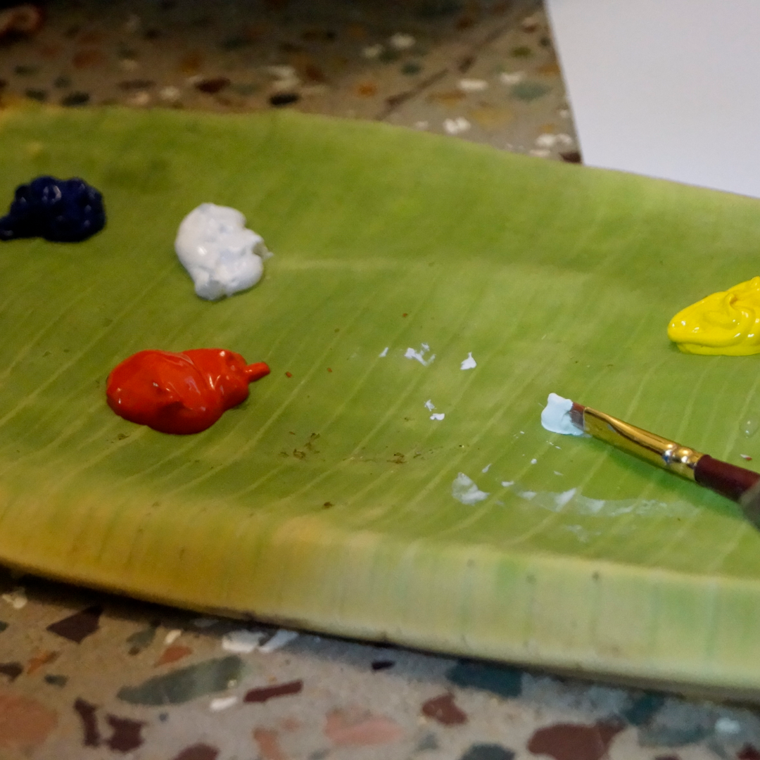
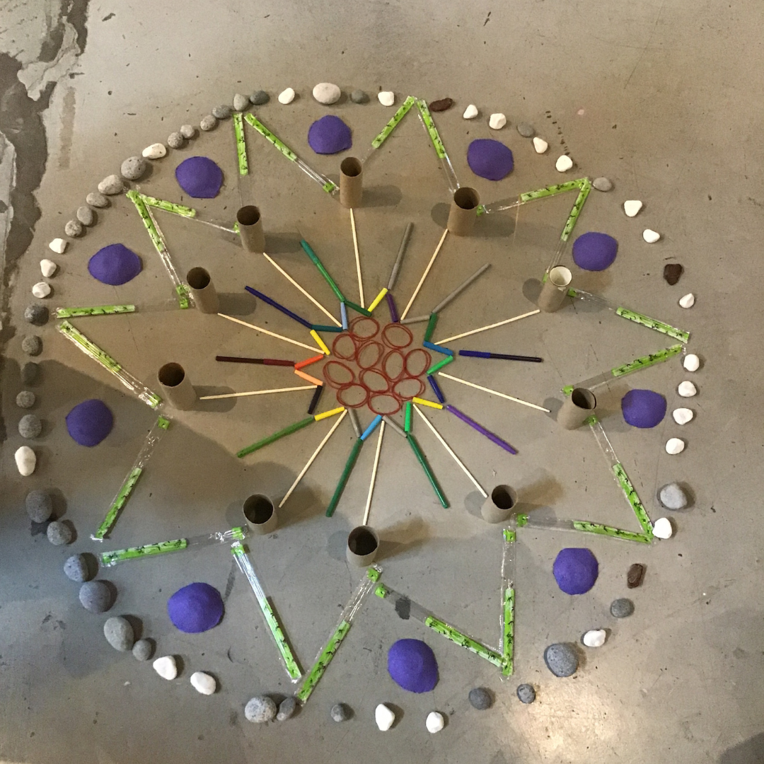
The choice to work with primary colours is inspired by the communicative and design elements of the Bauhaus art movement, which embrace simplicity and diversity. The soul of Bauhaus is to “Seek simplicity in diversity and economically utilize space, materials, time, and money.” The primary colours, red, blue, and yellow, are the purest and most basic hues. When mixed, they represent infinite opportunities that give shape to diverse perspectives, emotions, and inspirations to form multifaceted expressions of creativity. Just as these colours are fundamental to all other hues, the materials we use to provide art experiences are rooted in simplicity. Often, discarded items and natural materials serve as the foundational building blocks of our work.
Our values are grounded in our beliefs, vision and mission. They are aligned with some of the 17 global Sustainable Development Goals (SDGs). They are stepping stones to:

GET IN TOUCH TODAY FOR A COMPLIMENTARY CONSULTATION.